


¿Cómo debería verse su tablero de manejo de filas de espera?
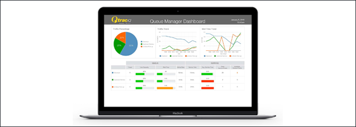
Queue management requires you to juggle many variables. Not only do you have to keep your customers happy while they wait, but you also have to optimize the queue in ways that benefit your business most. How do you do this when there are so many other tasks that demand your attention on any given day? The answer may lie in having the right dashboard. Like the dashboard on a vehicle, indicating how fast you’re driving, how much gas is left in the tank, and when the vehicle needs service, a queue management dashboard delivers key metrics to help managers understand the state of their queues and how best to maintain acceptable wait times, adequate staffing, and overall productivity. Assuming you have the technology in place to capture KPIs in your queues, that data should be delivered to you in an easy-to-access dashboard. Here’s what you should see:
1. It should showcase real-time and historical data
Real-time data lets managers address issues in the here and now. Historical data provides predictive intelligence to aid planning in the days, weeks, and months ahead. Managing from both sides is important and your dashboard should quickly reflect these angles.
2. It should be easy to understand
By its very nature a dashboard should be easy to understand. Back to the example of the dashboard in your car. Your speed, gas level, temperature gauge… it’s all quick and easy to digest. A brief glance down at the dashboard gives you immediate information about how much further you can drive before running out of gas and whether you should ease up on the gas pedal. Likewise, your queue management dashboard should give you key performance indicators in a format that makes decision-making and planning easy. How long are your wait times right now? Is there a queue sitting empty at the back of the building? Do you have a sudden influx of customers about to set your wait times out of acceptable range? These answers should come quickly. Look for key performance indicators like these to be readily available:
Wait times
- Average waiting time
- Total waiting time
- Max/Min waiting time
?Customer count
- Average customers in line
- Total customers in line
- Attrition rate
Service distribution
- Average/Total wait time per service point
- Average/Total customers per service point
- Open/Closed service points
3. It should be action oriented

Dashboards are only as good as the ability of managers to act on the information. Real-time alerts sent via text message, for example, can turn data into action by immediately notifying managers of KPIs that have fallen out of acceptable range. If you can’t think of a corresponding action to the data presented in your dashboard, you should be able to remove or add data views to ensure the dashboard is relevant to your business. Queue management technology and resulting dashboards can be incredibly valuable for businesses across a wide range of industries. Real time, historical, easy-to-understand, and actionable queuing data can help you improve customer satisfaction and business efficiency. To learn more, explore our intelligent queue management solution.
SUSCRIBIRSE
Suscríbase para mantenerse al día con los nuevos productos, información y noticias sobre los recursos.
ENTRADAS DE BLOG RECIENTES
Checkout: An Often Overlooked Opportunity
Leer el artículo completoEnsamble de Tempest con base de caucho
Leer el artículo completoHeavy Base Delineator Assembly
Leer el artículo completoHeavy Base Delineator
Leer el artículo completo